Have you ever thought how the colour psychology in branding may influence the feelings of others? It’s a known fact that colour can impact on a customer’s buying decision. And depending on the colour you use for your business, it can define your perceived value and meaning to others. For example, a hot red is passionate and can grab your attention. Whereas a cool blue is more soothing and is one of the most popular colours for businesses to use in their branding.
Let’s dive in deeper to understand what these colours mean and how they can be used.
The colour Red
RED is a physical colour and it evokes warmth, passion and excitement. But it can also mean aggression or a warning.
It has the effect of grabbing your attention, so it’s used a lot on warning signs, sale signs and traffic lights.
On a psychological level, it reminds us of blood. So this can stir up emotions of anger or to run away.
In China, the colour red is seen as lucky. And in some eastern cultures, brides wear red on their wedding day. But in South Africa, they wear red to mourn the dead.
In branding, a bright red can be a powerful colour and can be used to accent and highlight. It’s a colour to use if you want to stand out and it is usually seen on sale signs or call-to-actions.
Darker reds are more luxurious and you’ll see it used on expensive chairs, painted walls and linings for cases or jewellery.
Some big brands use red very successfully but it’s not for everyone. If nothing more, it shows you are passionate about what you do and you and your business (or product) like to turn heads.
In business, I would suggest you could use red for a cybersecurity business or burglar alarm company. Or maybe a dating business or supermarket.
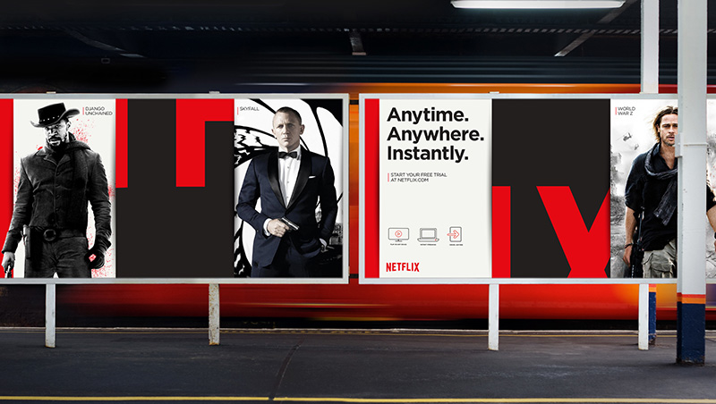
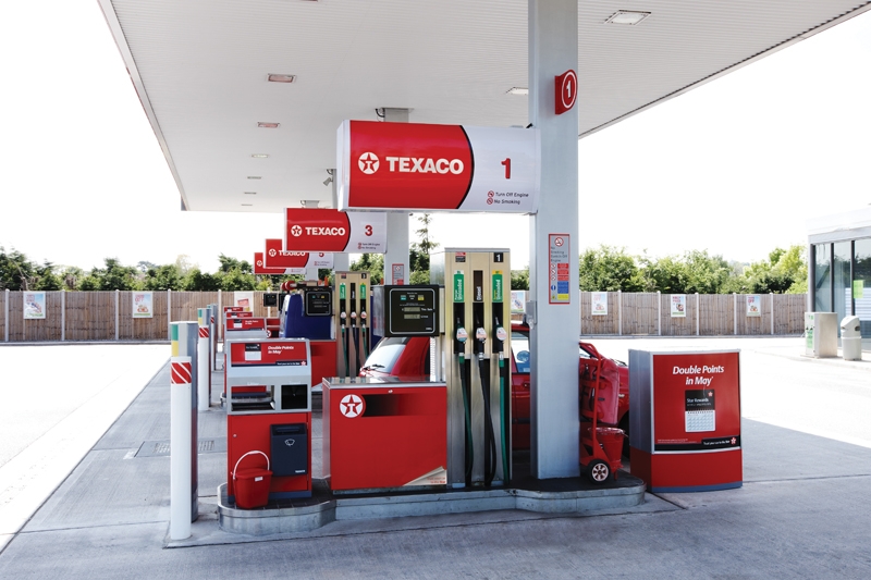
Brands use RED to stand out and provoke a reaction. Examples include Coca Cola, Tesco, Netflix, Nintendo, The Sun/Mirror (newspapers), KFC, Virgin, Texaco and many more.

The colour Orange
If you use ORANGE for your brand colour, here are some colour insights.
Let’s see if you made the right decision… Orange is vibrant. It’s hot, healthy, fruity and engaging.
It also symbolizes energy, vitality, cheer, excitement, adventure, warmth, and good health. So orange could be a great colour to use if you have a business in the health and wellness industries.
Globally it evokes the taste of healthy fruits, bursting with juice. It’s also symbolic of autumn.
Children all over the world are drawn to orange which may be due to it’s resemblance to the sun.
Because orange stands out so well, is used extensively for life rafts, hazard cones, and high visibility police vests. With these products in mind, If you run a health and safety company, orange would be a good colour to use.
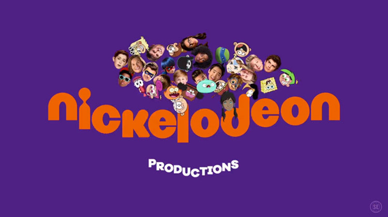
Brands using orange: Sainbury’s, Penguin Books, Harley Davidson, Fanta, Nickelodeon, Etsy, and many supermarket products
The colour Yellow
YELLOW is an energising colour. It reminds us of the sun, happiness, loyalty, gold and custard (Yum!).
So it is a great colour to use for lifting your emotional state. Though It can also signify cowardice and betrayal. Boo!
In Iran, it symbolises sickness and ill health. In some Asian countries, it signifies glory, wisdom and happiness.
Yellow stands out from a distance, so is used extensively in road maintenance for machinery and clothing. In some countries, it is used for Taxis and school buses.
In nature, it is used as a warning such as on wasps, tigers, poisonous frogs and leopards.
Many products use yellow to stand out on supermarket shelves. Although it is usually associated with bargain brands rather than premium products.
But if it’s tweaked to look more like gold, then that association is suddenly turned upside down.
In business, you could use yellow for a children’s’ product, a health-based business or if in the gold spectrum it could be used a premium service or product.
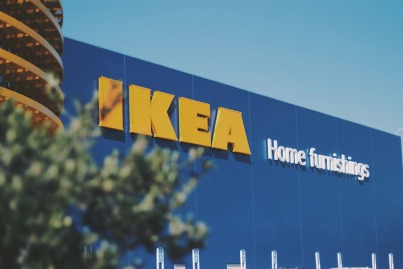
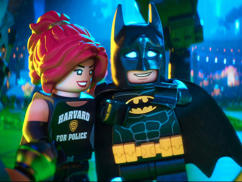
Examples of brands using yellow are McDonald’s, Ikea, Best Buy, Subway, Shell, Batman and CAT.
The colour Green
GREEN is the colour associated with nature, balance, stability, health, freshness, peace and growth. It can also be a sign of jealousy and envy.
Lighter, brighter greens are more vibrant and are sometimes used for health-based businesses and products.
Darker greens evoke affluence so you’ll see this colour used on banknotes and banks.
In the Bible the colour green represents immortality. It also represents resurrection and is clearly seen during Spring.
Green can sometimes be used as a visual representation of feeling unwell. Although this is generally used in comic books and illustrations.
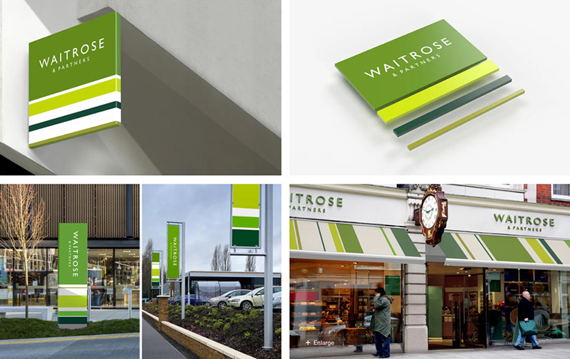
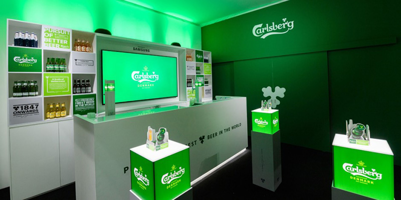
Examples of brands using green are Starbucks, BP, Holiday Inn, Carlsberg, More Than, Waitrose, Garnier and Xbox.
The colour Blue
BLUE is a cool colour and is the go-to shade for most businesses due to its worldwide popularity. It is also a primary colour.
It can represent communication, trust, logic, strength, but can come across as unfriendly.
Light blues evoke freshness and have a calming effect, and often symbolise the ocean or sky. This is usually the palette associated with surfing, refrigeration, IT and water.
Dark blues evoke strength and clear thought. It is often used in financial businesses, banks and car brands.
The colour blue also has some religious connections. The Virgin Mary is usually depicted wearing a blue robe for example.
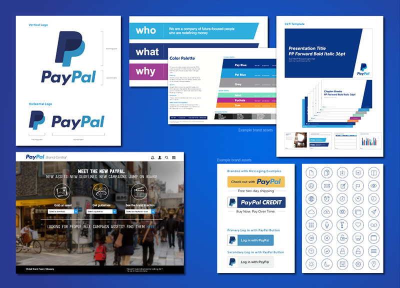
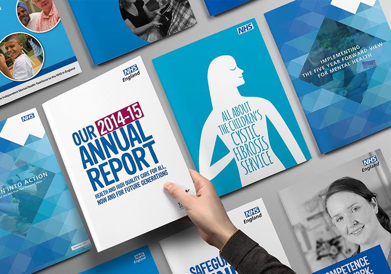
Examples of brands using blue are Volkwagen, NHS, Facebook, Oreo, PayPal, Barclays and The Blue Cross.
The colour Purple
Purple is a spiritual colour and is a mixture of red and blue.
It is often seen in meditative branding due to its calmness and association with the Lavender flower. It also has associations with space and cosmology and purple can often be seen in images of galaxies.
Lighter purples are more feminine and are associated with spring and romance. You’ll often see this colour on bathroom, home and beauty products.
Darker purples are more robust and are associated with quality and wealth. Luxury hotels and royalty tend to favour this palette. You’ll also see this used for health products that use dark berries as ingredients.
Before modern colour techniques where developed, snails used to be used to extract the colour purple. At the time it was very expensive to produce so the wealthy were the only ones who could afford it.
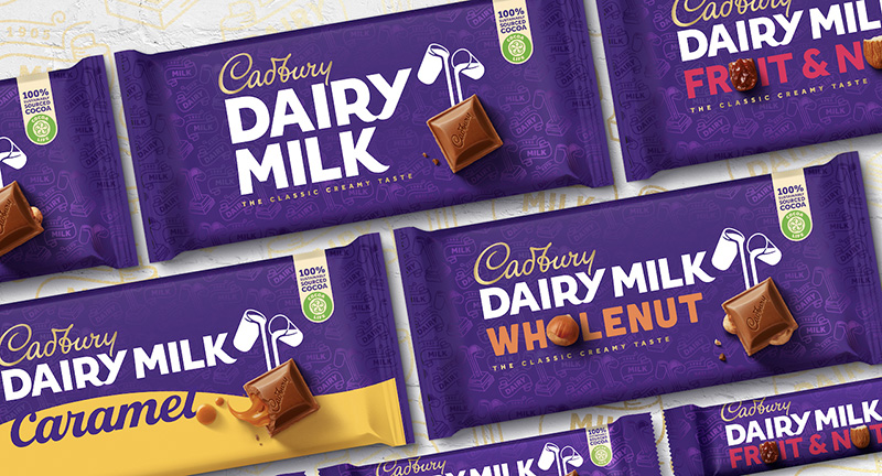
Examples of brands using purple are Cadbury’s, Wonka, FedEx, Purple Bricks and Yahoo.

The colour Black
Black can convey darkness, night and death. More positively it can be sophisticated, elegant and a sign of strength.
It is often used in fashion – think “small black dress”. It is popular among people who want to hide their body-shape or want to blend in.
In Chinese culture, it forms half of the classic yin and yang emblem.
Black can be seen as evil and is used extensively in good versus evil scenarios in modern culture. As child, I can remember watching Darth Vader dressed in black battling against Luke Skywalker dressed in white.
In branding it can be very versatile, and most logos will have a black only version for that reason.
But it can look oppressive and lacks any positivity, so it should be used sparingly and with care.
You will see this colour on expensive perfume and aftershave branding, on a premium box of chocolates, on limousines, Apple products and some sports brands.
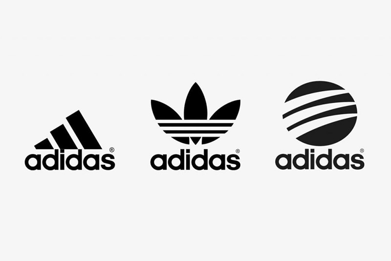
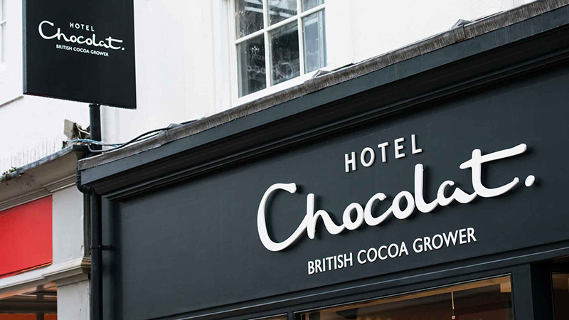
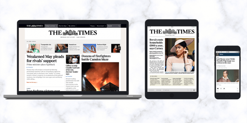
Examples of brands using black are Apple, Hotel Chocolat, Adidas, Nike, The Times Newspaper and the BBC.